The Optimal UI/UX Architecture for Blood Pressure Monitoring Apps
A strategic blueprint for developing cardiovascular dashboards that mitigate anxiety and drive longitudinal adherence.
The proliferation of mobile health (mHealth) applications has fundamentally transformed the management of chronic conditions, particularly hypertension. With home blood pressure measurements possessing equal or even greater predictive value for cardiovascular outcomes compared to isolated clinical readings, the necessity for robust, user-centric monitoring applications is paramount.
However, the efficacy of these digital tools is intrinsically linked to their User Interface (UI) and User Experience (UX) design. Poorly designed applications exacerbate cognitive load, induce data-related anxiety, and ultimately lead to user abandonment, thereby nullifying their clinical utility.
This comprehensive report delineates the optimal UI/UX architecture for blood pressure and pulse monitoring applications across mobile and iPad platforms. Grounded in human factors engineering, clinical data visualization best practices, and 2026 accessibility mandates, this analysis provides a blueprint for developing cardiovascular dashboards that serve both the anxious patient and the clinician conducting a rapid review.
1. The Clinical and Cognitive Context
Before architecting an interface, it is critical to understand the physiological nature of blood pressure and the psychological state of the end user. Blood pressure is a highly dynamic metric, fluctuating moment-to-moment based on circadian rhythms, stress, physical activity, and medication efficacy.
A single reading consists of a paired numerical value: Systolic Blood Pressure (SBP) and Diastolic Blood Pressure (DBP). Because this data is intrinsically paired, decoupling it can lead to misinterpretation. Furthermore, the act of measuring blood pressure is frequently accompanied by profound anxiety ("white coat hypertension").
If an application presents raw, highly volatile data without context, it can induce a "home white coat effect," where the user becomes intensely anxious over benign outliers. The UX strategy must be calibrated to mitigate this anxiety through frictionless data capture and anxiety-reducing visualization.
2. Frictionless Data Entry
The fundamental prerequisite for any longitudinal health tracking application is sustained user adherence. If data entry introduces friction, compliance degrades.
The Ergonomic Fallacy of the Scroll Wheel
Historically, iOS apps used scroll wheels (UIPickerView). For entering three distinct values (SBP, DBP, Pulse), this is ergonomically taxing. Older adults often experience decreased fine motor control. Scrolling through numbers to land on "135" requires sustained visual attention and micro-motor adjustments.
The Superiority of the Numeric Keypad
The optimal manual interface is a persistent, large-format numeric keypad. It provides immediate, definitive inputs. The UI should employ automatic field advancement: once the user inputs three digits for systolic, focus should jump to diastolic.
AI-Powered Optical Character Recognition (OCR)
The vanguard of 2026 design utilizes machine vision. Users simply point their camera at the blood pressure monitor's display. AI instantly captures and parses SBP, DBP, and pulse, eliminating transcription errors and accommodating users with visual impairments.
Passive Synchronization
For Bluetooth-enabled monitors, data ingestion should be passive via Apple Health (HealthKit) or Google Health Connect, removing manual effort entirely.
Contextual Tagging
A reading in a vacuum lacks clinical utility. The flow must allow rapid tagging (Arm Position, Posture, Timing, Symptoms) and medication logging to correlate pharmacological interventions with cardiovascular responses.
3. Architecting the Visual Language
Once captured, data must be visualized to be comprehensible to a layperson yet clinically useful to a physician.
The Two-Line Paradigm
Plotting SBP and DBP requires a strict two-line paradigm on a single graph. Differentiating data sources (home vs. office) should be done via symbol alteration (circles vs. squares) rather than adding more lines, which creates clutter.
Pre-Attentive Goal Bands
The chart background must feature colored goal range bands (Green for Normal, Yellow for Elevated, Red for Hypertension). This allows users to utilize pre-attentive processing to instantly judge severity without reading Y-axis numbers.
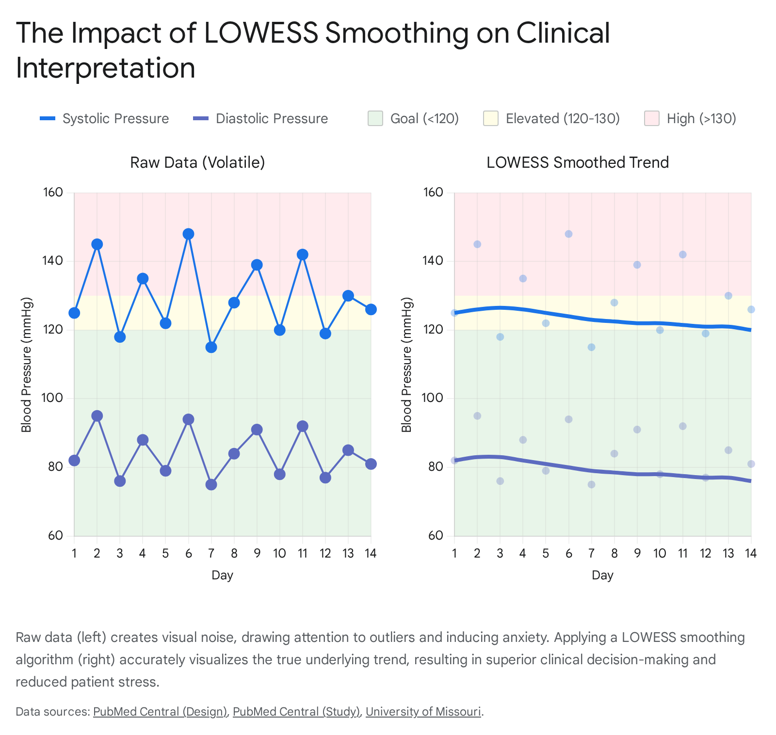
Data Smoothing (LOWESS)
Raw BP data is "visually noisy." To counteract anxiety caused by jagged peaks, the UI must overlay a smoothed trendline generated by a LOWESS algorithm. This reveals the true trajectory of health while minimizing the visual weight of isolated outliers.
Resolving the Dual-Axis Trap: Small Multiples
Plotting BP (mmHg) and Pulse (bpm) on the same chart with dual axes inevitably leads to intersecting lines, implying false correlations. The best practice is "Small Multiples": vertically stacked charts sharing a synchronized X-axis. The top chart shows BP lines; the bottom chart shows Pulse bars.
4. Temporal Navigation: Daily to Yearly
- Daily View: Focuses on micro-fluctuations. Uses dot plots and a medication timeline to correlate intake with pressure drops.
- Weekly View: Aggregates 7 days to show lifestyle impacts. Uses "High-Low" bands around daily averages to preserve variance.
- Monthly View: Focuses on longitudinal trends. The LOWESS curve is mandatory here. Displays derived metrics like Pulse Pressure and Mean Arterial Pressure.
- Yearly View: Shifts to "Time-in-Range" (TIR). Uses horizontal stacked bars to show the percentage of readings in Normal vs. Hypertensive zones, providing a better risk summary than a simple average.
5. iPadOS Spatial Architecture
Adapting for iPad requires a shift to desktop-class interactions. The gold standard is the Three-Column Split View:
- Primary Pane (Sidebar): Global navigation (Dashboard, Logbook, Analytics).
- Secondary Pane (List): Scrollable history or filters.
- Tertiary Pane (Canvas): The expansive detail view for complex graphs and bento-box data summaries.
This facilitates the clinician's "90-second review," allowing them to see the patient narrative at a glance without navigating back and forth.
6. Inclusive Design & Accessibility
The primary demographic is older adults. Adherence to 2026 WCAG mandates is non-negotiable.
- Motor Control: Minimum tap target size of 44x44 pixels with ample negative space.
- Visual Acuity: High contrast ratios (4.5:1). Support for Dynamic Type (large text). Avoid relying solely on color to convey status (use text labels and icons).
- Liquid Glass Paradigm: While modern Apple design uses translucency, it must be restricted to navigation layers. The primary data canvas must remain opaque and high-contrast to ensure legibility.
Conclusion
The optimal UI/UX for blood pressure monitoring synthesizes clinical accuracy with empathy. By removing ergonomic barriers, smoothing volatile data, and respecting the specific needs of an aging demographic, we can create applications that transform a source of anxiety into a tool for empowerment and clinical insight.